BlueScope Steel
BlueScope is one of the world’s leading manufacturers of painted and coated steel products. They required a consistent brand identity across all their global products to position BlueScope as a modern future-focused brand.
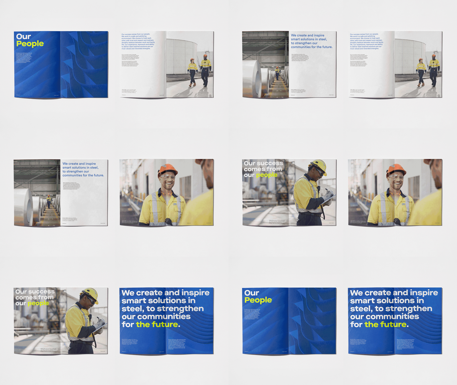
We set out to develop a set of consistent brand identity elements. Inspired by the core idea ‘Creating Strength’ a bold graphic device ‘The Flex’ was developed to underpin the new brand toolkit. This became a consistent device that was applied across the brand to reflect BlueScope’s core product steel.
To support ‘the Flex’ asset we commissioned photographer Tim Jones to capture a suite of reportage imagery focussing on BlueScope’s core strength, their people. The result is a collection of warm, humanist images that represents the diversity of their workforce, and complements the bold typography and simple modular system.
We already knew BlueScope is a blue brand, so we took the opportunity to refresh this core colour and develop a complimentary secondary palette of accent colours to support the digital touchpoints.
The masterbrand logo was evolved and redrawn to give it a modern aesthetic. We applied the new brand typeface to all master and sub-brand lockups.


