r.a.r.e yoga studio
r.a.r.e was founded as a contemporary yoga studio based around the idea of connecting to one’s self and the others you share your class with.
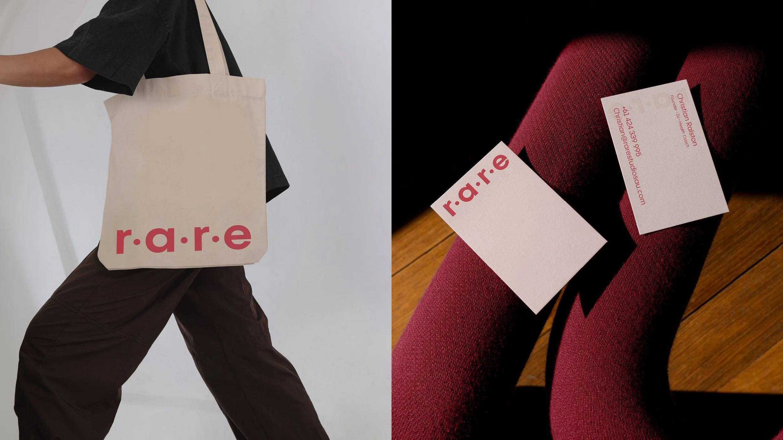
A simple brand system was developed to represent these connections using a series of graphic dots. The dots were incorporated into the logo as punctuation elements of the studios acronym (raising.awareness.reaching.excellence). They are also a nod to the studios three founders. The dots have multiple graphic uses and became a tool to tell the connectivity story across the brand’s touchpoints, from instagram to studio fitout.
The contemporary colour palette postions the brand differently to the usual earthy tones of the sector, and a suite of warm photography was developed to convey the idea of connection to one’s self.